This Manual serves as a comprehensive guide to understand and utilize the IANN (Intelligent Artificial Neural Network) system effectively. It provides essential information about the system’s purpose, core components, and operational guidance to help users make the most of its capabilities.
IANN (Intelligent Artificial Neural Network) is Pragma Edge’s AI-powered unified platform designed to bring intelligence, automation, and predictive analytics into business operations. It combines file tracking, monitoring, and AI-driven insights to ensure end-to-end visibility, operational efficiency, and proactive issue resolution.
IANN plays a key role in driving digital transformation across industries by turning traditional data exchanges into intelligent, insight-driven processes.
IANN is built as a modular system with three primary components:
- FileGPS – Tracks and monitors file transactions across systems for visibility and SLA compliance.
- Monitor – Provides real-time monitoring of processes, system health, and metrics with alerts.
AI – Adds intelligence through predictive analytics, anomaly detection, and GenAI insights.

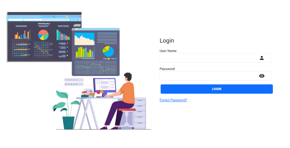
The “Forgot Password” feature allows users to securely reset their password if they are unable to remember it. By clicking the “Forgot Password” link, users are directed to a recovery page where they can update their login credentials through a step-by-step verification process.
Steps to Reset Your Password:
1. Enter User ID and Captcha
Begin by entering your User ID and completing the Captcha, which ensures the request is from a legitimate user and helps prevent automated attacks.

2. Receive OTP via Email
Based on the entered User ID, a One-Time Password (OTP) will be sent to the registered email address associated with your account.
3. Reset Password
a. Enter your username in the User ID field.
b. Provide a new password and re-enter it to confirm.
c. Enter the Captcha as shown.
d. Input the OTP received via email and submit the form.

4. Submit and Update Password
Once you click Submit, your password will be updated successfully to the new one.
To create a new environment in IANN Monitor, the following fields are mandatory and must be filled out:
1. Environment
2. Environment Name
3. Index Prefix
Make sure to use a valid Index Prefix as defined in the config.ini file or Kubernetes ConfigMap.
Click the +Create button to add the new environment.
Note: The Environment Name field does not support special characters. Only alphanumeric values are allowed.

In the “Manage Environment” section, you will see a list of environments with fields “Name,” “Prefix,” and “Action.” Within the “Action” column, you can perform actions such as editing or deleting the environment as needed.

When you click on Environment Switch, a list of environments you’ve created will appear in a pop-up window. From here, you can select the desired environment for your current task.
Once an environment is selected, you will be redirected to its landing page.
To access dashboards within the selected environment, click on Manage Dashboard. If no dashboards have been created yet, the Manage Dashboard section will appear empty.

To create a new dashboard, click on the Add Dashboard icon as shown in the screenshot.

Enter a title for your dashboard and click Save to complete the creation process.

If you want to create a new panel, click on the Icon mentioned in the screenshot. After that row was added successfully.

Initially, each panel shows three icons:
1. Settings Icon – Allows you to rename the panel title.
2. Delete Icon – Removes the panel entirely.
3. Down Arrow – Expands or minimizes the panel

Once you expand the panel using the down arrow, you’ll see a ‘+’ (Add Graph) icon like in the screenshot below:
Using the Add Graph option, you can add any type of graph based on your requirements.

When you select Add Graph, you will be directed to the Create Graph page as shown below.

Each query consists of several key steps:
1. Select Metric Type
Choose the aggregation method for your data:
a. Average: Calculates the mean of numeric values for each time bucket.
b. Sum: Computes the total of all numeric values within each time bucket.
c. Count: Returns the number of records/documents within each time bucket.
Note: Query creation is not applicable for Table Graphs.
Time-Based Data Bucketing:
To create meaningful time-series graphs, data is grouped into dynamic time buckets using a Date Histogram Aggregation. The bucket size adjusts automatically based on the selected time range to maintain chart readability and performance.
This bucketing applies to Average, Sum, and Count aggregations.
Time Range | Bucket Interval |
≤ 12 hours | 1 minute / 5 minutes |
1 day | 5 minutes |
< 3 days | 10 minutes |
< 5 days | 25 minutes |
< 7 days | 70 minutes |
≤ 30 days | 10 hours |
≤ 60 days | 13 hours |
≤ 180 days | 15 hours |
≤ 365 days | 1 day |
> 365 days | 2 days |
This logic ensures that charts remain readable and performant regardless of the data volume or time span.
2. Choose Query Type
Three query types are supported:
3. Field-Only Query
a. Input: Field name
b. How it works: Data is fetched directly from the specified field and visualized as per the selected graph type.

4. Filtered Query
a. Input: Filter field and filter value
b. How it works: Data is filtered based on the provided condition and then visualized.

5. GroupBy Query
a. Input: Enable Group By checkbox and specify the field to group by
b. How it works: Unique values from the Group By field are used to create multiple
visual elements (e.g., lines, bars, gauges).

Note: When Group By is enabled, only one query can be created. Multiple queries are supported only when Group By is not used.
6. Set Alias Name
Provide an alias for your query. This name will be displayed on the graph legend, making it easier to identify the data.
7. Save the Graph
Once all the details are configured, click Save Graph to generate and add the graph to your dashboard.
A line graph displays data trends over time. It’s ideal for visualizing metrics like CPU usage, memory consumption, or traffic patterns.

When to Use:
1. To monitor continuous data over time
2. To compare multiple data lines

3. To highlight fluctuations and trends
Supports:
1. Units (Numeric, Percentage, Bytes)
Defines how the data values are formatted and displayed in the graph.
(e.g., CPU usage as Percentage, file size in Bytes, or raw numbers as Numeric)
2. Metrics (Average, Sum, Count)
Specifies the aggregation method applied to the selected field.
(e.g., calculate average CPU usage, total disk I/O, or count of events)
3. Multiple Queries
Allows adding more than one query to compare or overlay different data points in a single graph.
(Useful for showing different fields or filters side-by-side)
4. Group By
Splits data into multiple visual elements based on the unique values of a selected field.
(e.g., CPU usage per server, requests per endpoint, etc.)

5. Tooltip (Hover to see detailed values)
Displays precise data values when you hover over graph elements.
(Helps users view exact numbers without cluttering the graph)

6. Legends with Filtering and Sorting
a. Sorting Options: Legends can now be sorted in three modes:
i. Ascending: Sort legend items from lowest to highest value.
ii. Descending: Sort legend items from highest to lowest value.
iii. Normal: Display legend items in their original order (default).
b. Quick Filtering:
You can filter by legend value to instantly locate and highlight a specific data point, helping you analyze exact values more quickly

Gauge graphs are used to represent a single metric value against a fixed scale. They are ideal for showing real-time status or capacity usage, such as CPU load or active connections.
When to Use:
1. To show current system status
2. To visualize values in a fixed range (e.g., 0–100%)
Behaviour:
1. For values greater than 0, the status is shown as “Running”
2. For value 0, the status is displayed as “Stopped”
Supports:
1. Metrics (Average, Sum, Count)
Specifies the aggregation method applied to the selected field.
(e.g., calculate average CPU usage, total disk I/O, or count of events)
2. Multiple Queries
Allows adding more than one query to compare or overlay different data points in a single graph.
(Useful for showing different fields or filters side-by-side)


3. Group By
Splits data into multiple visual elements based on the unique values of a selected field.
(e.g., CPU usage per server, requests per endpoint, etc.)

Bar graphs display categorical data using rectangular bars. Each bar represents a different data value or category.

When to Use:
1. To compare values across different categories
2. To use with Group By for multiple bars
Supports:
1. Metrics (Average, Sum, Count)
2. Group By

3. Multiple Queries (if Group By is not enabled)
4. Legends with Filtering and Sorting
a. Sorting Options: Legends can now be sorted in three modes:
i. Ascending: Sort legend items from lowest to highest value.
ii. Descending: Sort legend items from highest to lowest value.
iii. Normal: Display legend items in their original order (default).
b. Quick Filtering:
You can filter by legend value to instantly locate and highlight a specific data point, helping you analyze exact values more quickly.

Text graphs show a single metric as plain text. Useful for showing key values (like today’s count, latest status, or totals).

When to Use:
1. To display a summary or headline metric
2. For dashboards with limited space
Supports:
1. Metrics (Average, Sum, Count)
2. Group By

3. Multiple Queries (if Group By is not enabled)
The Table graph type presents data in a tabular format, ideal for users who prefer
structured and detailed information to display.

When to Use:
Use the Table graph when you want to view data in a structured, row-column format that supports detailed analysis, sorting, filtering, and keyword-based searches.
Ideal for log records, alerts, and data comparisons.
Supports:
1. Tabular Representation: Displays data in a clean, structured table format.
2. Table Search:
Search Using
Column Name: To filter the data in table for a particular column use column Name:
keyword to search in Filter By field in query and update the graph.
Search Using keyword: Directly enter the keyword you want to search for in the “Filter By ” field. It is useful to search all the column values in the table.


Note: Search with special characters other than underscore won’t be possible.
3. Sorting:
Each column includes up/down arrow icons to sort data in ascending or descending order.
4. Pagination:
Enables smooth navigation across large datasets when editing.


5. Enable & Disable Columns:
In the Table Graphs section, you can choose which fields you want to show or hide using the Modify Headers option.
If you only want to display certain fields in the table:
a. Click on Modify Headers.
b. A list of available fields will appear with checkboxes.
c. Uncheck the fields you don’t want to display.
d. Click Save.
e. The table will now only show the fields that are checked.
Example:
In the screenshot below, the fields Certificate Expiry Date and Created Date are unchecked. So, these fields won’t appear in the table — only the remaining checked fields like TIMESTAMP, Days, and Name will be visible.

6. Modify Table Column Position:
In the Table Graphs section, you can rearrange the order of fields using drag and drop functionality in the Modify Headers section.
If you want to change the position of a field:
a. Click on the Modify Headers button.
b. Hover your mouse over the field name you want to move.
c. Click and drag it to the position where you’d like it to appear in the table.
d. Once you’re happy with the new order, click Save.
Example:
In the screenshot below, the Name field has been moved to the second position and Days is placed third — just by dragging and dropping them into the desired order.

7. Dynamic Field Names:
For table graphs, users have the option to customize or rename field headers according to their preferences.
To do this:
a. Go to the Edit page of the Table Graph.
b. You’ll find an option called Modify Headers (as shown in the screenshot below).
 Once you click on Modify Headers,
a list of all the current field names in the table will appear (see screenshot below).
To change a field name, simply click on it, type the new name, and then click Save.
8. The updated field name will now be displayed in the table.
Example:
In the screenshot below, the Name field has been moved to the second position and Days is placed third — just by dragging and dropping them into the desired order.

In Panel view, the timestamp position is fixed at the beginning and cannot be changed, ensuring consistent visualization across all panels.
Graph Resize:
To resize the graph component, use the resize handle located at the bottom-right corner of the panel (as highlighted in the image). The handle is represented by a wrench-like icon. Simply click and drag this icon to adjust the graph’s dimensions according to your preference.

Drag and Drop:
Hover near the top area of the graph to reveal the drag handle. hold to move the graph and rearrange its position on the dashboard Panels.
Note: Drag and drop is only possible within the panel.

Located at the upper right side of the interface, the calendar feature allows users to retrieve specific data by selecting a date. This is particularly useful for accessing historical data that occurred on a specific day. Users can click on a date within the calendar to choose their desired date, and the system will retrieve data related to that selected date.

The auto-refresh functionality is a convenient feature that automatically updates or refreshes the displayed data at regular intervals. Users have the option to turn this feature on or off based on their preferences.
Auto Refresh Off:
Users can disable auto-refresh if they prefer to manually refresh the data or if they want to freeze the data at a specific point for analysis.
Theme Options: We provide both dark and light themes for the interface, with the default theme set to dark. This means that when you initially access the application, it will be in dark mode by default. However, you have the flexibility to switch to the light theme if you prefer a different visual style.
A toggle button allows users to switch between light and dark themes for a more personalized viewing experience.

Dark Theme:
Light Theme:

The IANN Monitor application includes a CSV download feature that allows users to export data displayed in graphs for a specified time interval selected in the calendar.
Check out the information below on downloading CSV files:
1. Select the graph from which you want to download the CSV data, then click the download button located at the top of the graph.

2. Check your Downloads folder for the file, then open it to view the data.
In this we have two features as shown below.
1. Notification Channel
2. Configuring Alert

Used to configure alerts to be delivered to various external systems and communication channels such as PagerDuty, ServiceNow, XMatters, and Email. This ensures timely reporting and incident response across integrated platforms.
When you click on Notification Channel, you will be navigated to a new page that contains two main sections:
- Create Notification Channel
- Manage Notification Channel

To create a new channel:
1. Click on Create Notification Channel.
2. Fill in the following details:
a. Channel Name:
Enter a name for the notification channel you are configuring.
b. Channel Type:
Choose the type of channel from the dropdown list. The available types include:
i. Email
ii. ServiceNow (Snow)
iii. XMatters
iv. PagerDuty
Channel Type Configuration Details
1. When Email is selected as the channel type, an additional field for Email Address will appear.
2. Enter the email address to which alerts should be sent.

ServiceNow (Snow)
1. When Snow is selected, the following fields will appear:
a. URL
b. Username
c. Password
d. Severity levels: Critical, Warning, No Data
2. Fill in the ServiceNow integration details and select which severities should be reported.

XMatters
1. When XMatters is selected, the following fields will be displayed:
a. XMatters URL
b. XMatters Username
c. XMatters Password
d. Severity levels: Critical, Warning, No Data
2. Provide the XMatters configuration details and select the alert severities to report.

PagerDuty
1. When PagerDuty is selected, the following fields will appear:
a. Routing Key
b. Severity levels: Critical, Warning, No Data
2. Enter the PagerDuty routing key and select the applicable alert severities.

Additional Settings
1. Set Reminder:
Enable this option to configure a time interval for repeated alert reminders.
2. Default:
Enable this to set the configured channel as the default for specific alert types.
Once all the required details are provided, click the Create button at the bottom-left corner of the screen to save the channel.

When you click on the Manage Notification Channel, you will get the list of notification channels below.

When you click on Action, it displays Edit and Delete options, which allow you to modify or remove the channel configuration.

The Alerts feature enables users to monitor key metrics and receive notifications when thresholds are breached. Users can configure alerts with different severity levels (Critical, Warning, No Data, etc.), set reminder intervals, and route alerts to various channels like Email, PagerDuty, ServiceNow, or XMatters.
Each graph can have multiple alerts, but only the top three are displayed by default. Alerts can be paused, resumed, or edited as needed. Advanced options like Group By Alerts and Dynamic Alerts offer more flexibility and clarity.
This feature ensures timely awareness of system issues, helping teams act quickly and efficiently.
To create or modify alerts on the Graph page:
- Navigate to the Alerts tab in graphs inside panels.

- Fill in the required information:
- Alert Name
- Query to which alert to be configured
- Evaluation Frequency (in minutes)
- Alert Category – either Critical or Warning
- Notification Channel – where alerts should be sent
- Custom Message (optional)
Note: Although you can configure multiple alerts, only the top three alerts are visually represented on the graph. To view all configured alerts, click on the Edit option. If a decimal number is used in alert configuration, it will be interpreted as a whole number.
The system categorizes alerts into the following six types:
- Critical Alerts
Triggered when a monitored value crosses a defined threshold, based on the configured condition:
- isAbove: Alert is triggered if the value exceeds the threshold.
- isBelow: Alert is triggered if the value falls below the threshold.
This allows accurate detection of abnormal spikes or drops for timely intervention.
Sample Email Notification:

- Warning Alerts
These act as early indicators of potential issues. A warning alert is raised when a value falls within a configured range:
- warningFrom: Lower bound of the warning range
- warningTo: Upper bound of the warning range
If the value lies between these bounds, a warning alert is generated—providing time for proactive action.
Sample Email Notification:

- OK State Alerts
Indicates that the configured alert is active but none of its triggering conditions (Critical, Warning, No Data) were met. It confirms that:
- The alert is correctly configured.
- The monitored value is within acceptable limits.
- No Notifications will be raised to this type of alerts.
- No Data Alerts
If the “No Data” checkbox is selected during configuration, an alert will be triggered when no data is received during the evaluation period—highlighting gaps in data availability.
Sample Email Notification:

- Paused Alerts
If the Pause toggle is enabled for an alert, it is temporarily disabled. While paused, the alert notification will not trigger—even if its conditions are met. It can be reactivated using the Resume option.
- Reminder Alerts
Reminder alerts serve as follow-up notifications when an issue remains unresolved. They continuously alert users at configured intervals until the condition is cleared—ensuring visibility and timely action on persistent issues.
Dynamic alerts enable real-time data insertion into alert messages using placeholders. This enhances message clarity and relevance.
To use dynamic alerts:
Insert a variable using the @ symbol followed by the field name in your message.
For example:
Message: CPU utilization is high on the @server
When the alert is triggered, @server will be automatically replaced with the actual server name (e.g., node1), producing:
Message: CPU utilization is high on node1

Note: Ensure that the placeholder matches the exact field name used in the alert context to ensure proper substitution.
The Alerts Data Page provides a centralized view of all system or application alerts. It helps users monitor the health and performance of various components in real time.
Key Features:
1. Alert Summary Bar
Displays the total count of alerts categorized by severity:
a. Critical: Indicates serious issues requiring immediate attention.
b. Warning: Highlights potential issues that may need investigation.
c. Ok: Represents components functioning within acceptable thresholds.
d. No Data: Occurs when data is unavailable or not received.
e. Paused: Alerts that have been temporarily disabled.
2. Tabular View
The table lists detailed information for each alert, including:
a. Alert Name: The name or identifier of the alert.
b. Timestamp: The last time the alert was triggered or evaluated.
c. Status: The current state of the alert (e.g., Critical, Ok).
d. Pause/Resume Control: Allows users to enable or disable individual alerts.
3. Maintenance Mode
A single-click option to pause or resume all alerts at once. When all alerts are paused, no notifications will be sent to configured channels.
4. Filter and Search Options:
Users can:
a. Search for alerts by name or status.
b. Use severity filters to view specific types of alerts.
c. Customize the display by selecting alert categories of interest.

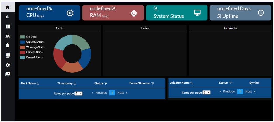
The Landing Page provides a comprehensive overview of key system components and health indicators. It offers real-time insights across several critical modules, allowing users to monitor the overall state and performance of the system at a glance. The modules displayed include:
The landing page provides a consolidated view of infrastructure health, application uptime, and active alerts across your environment.
1. Infrastructure Monitoring:
1.1. Common Metrics for VMs and OpenShift:
1.1.1. CPU Usage: Shows current processor usage levels.
1.1.2. RAM Usage: Indicates memory consumption.
1.1.3. Disk Usage: Tracks disk space utilization.
1.1.4. Network Usage: Monitors network traffic and performance.
1.2. Additional for Virtual Machines (VMs):
1.2.1. System Status: Displays the real-time operational status of each VM.
1.3. Additional for OpenShift:
1.3.1. Total Nodes: Displays the total number of nodes in the OpenShift cluster.
1.3.2. Active Nodes: Indicates the number of nodes currently in a healthy and active state.
2. Application Monitoring:
2.1. Sterling Integrator (SI):
2.1.1. SI Uptime: Shows if the SI service is operational.
2.1.2. Adapter Status: Displays the status of configured adapters.
2.2. Maximo Application Suite (MAS):
2.2.1. MAS Uptime: Monitors the availability of the MAS environment.
2.2.2. Application Status: Tracks uptime of individual Maximo applications.
3. Alert Monitoring:
3.1. Alert Summary:
3.1.1. Displays the count of alerts by type (e.g., Critical, Warning, Info).
3.2. Alert List:
3.2.1. Timestamp – When the alert was raised.
3.2.2. Alert Status – Current state (e.g., Active, Resolved).
3.2.3. Alert Name – Description or identifier of the alert.
3.2.4. State – Indicates whether the alert is Paused or Resumed.

10.1.1 System Status
Displays the current health status of the overall system as a percentage, indicating whether it is operating smoothly or experiencing issues.
10.1.2 RAM
Displays the current memory utilization of the system as a percentage, providing insights into how much RAM is being consumed.
10.1.3 CPU
Shows the current processor usage as a percentage, helping to monitor system performance and detect potential load or bottlenecks.
10.1.4 App Availability
Indicates the number of continuous days the Sterling Integrator (SI) application has been running without interruption, reflecting overall application uptime.
10.1.5 Alerts Overview
1. Visualizes all system alerts using a pie chart.
2. Each color in the chart represents a different alert type.
3. Hovering over a segment displays the count of alerts for that type.
10.1.6 Disk
Displays disk usage in the form of bar graphs, showing the used storage capacity of available disks.
10.1.7 Network
1. Network Inbound Traffic: Shows the volume of incoming network traffic, typically measured in bytes/sec.
2. Network Outbound Traffic: Shows the volume of outgoing network traffic, also measured in bytes/sec.
10.1.8 Alerts List
Provides a detailed list of system alerts, including:
1. Alert Name: The name or description of the alert.
2. Timestamp: When the alert was triggered.
3. Status: Indicates the severity or nature of the alert (e.g., Critical, No-Data).
4. Resume/Pause: Allows administrators to resume or pause alert tracking as needed.
10.1.9 Adapter Status
1. Adapter Name: Displays the name or identifier of the adapter.
2. Status: Shows whether the adapter is Connected or Disconnected.

The Landing Page provides a real-time overview of critical system metrics through separate, focused modules. Each module highlights a specific aspect of the system’s operational status.
10.2.1 Node Health
Displays the overall health of the system as a percentage, helping identify if the node is performing optimally or facing any issues.
10.2.2 RAM Usage
Shows the current memory utilization as a percentage, offering insights into how much RAM is actively being consumed.
10.2.3 CPU Usage
Displays the current processor usage as a percentage, helping monitor system load and detect potential performance bottlenecks.
10.2.4 App Availability
Indicates the number of continuous days the Sterling Integrator (SI) application has been running without interruption, providing a measure of system uptime and stability.
Provides an overall health indicator or status of the system, indicating whether it is running smoothly or if there are issues.
10.2.6 Alerts Overview
1. Alerts are visualized using a pie chart, with each color representing a different type of alert.
2. Hovering a segment displays the count of alerts associated with that type.
10.2.7 Disk Status Module
Displays disk usage using bar graphs, representing the used storage space of each disk relative to its total capacity.
10.2.8 Network Status Module
1. Network Inbound Traffic: Shows the volume of incoming network traffic, typically measured in bytes/sec or bits/sec.
2. Network Outbound Traffic: Shows the volume of outgoing network traffic in similar units.
10.2.9 Alerts List Module
This module provides a detailed, tabular view of all active alerts:
1. Alert Name: Displays the name or description of the issue.
2. Timestamp: Indicates the exact time and date the alert was triggered.
3. Status: Shows the current status of the alert (e.g., Critical, No-Data).
4. Resume/Pause: Allows administrators to resume or pause specific alerts as needed.
10.2.10 Adapter Status Module
1. Adapter Name: Shows the name or identifier of each adapter.
2. Status: Indicates the current status of the adapter (e.g., Connected, Disconnected).

The Default Dashboard is a ready-to-use view that displays key system metrics and performance indicators. It includes essential panels to help users quickly monitor system health and performance without any manual setup.

When you click on default dashboard you will get a popup as displayed below.

Need to provide the Dashboard name and select the Notification channel name to which the graphs are to be configured (We can select single or multiple notification channel names) and after clicking ‘create’ the default dashboard is created (takes at least 1min to create).
The Default Dashboard for Sterling Integrator includes the following pre-configured panels and graphs, providing a comprehensive overview of system activity and performance.


11.1.1. SDE
Application Status:
System status
contains the App Availability graph
App Availability: It represents the Number of days from when the SI application is up and running.

11.1.2. SI Metrics:
Metrics consists of SI Metrics, SSP CM Metrics, SSP PS NODE3 Metrics and SSP PS NODE1 Metrics. In this panels contains CPU, RAM, NETWOEK, DISK UTILIZATION data in form of graphs.

11.1.3. Perimeter Server Status:
It will show perimeter server status in gauge graphs.

This report group has the following data points
Purge Count: Purge cleans up the business process data once it completes its life span.
Archive Count: Purge cleanup the business process data once it completes its life span.
Index Count: It represents the count of index which sets all completed or terminated business process data to be ready for archiving or purging.
DB Usage: It represents the overall database size utilized by the SI table space.

It represents a collection of open and connections with the database in the SI.

This report group has the following data points
Halted Count: It shows the number of Business processes which are halted.
Halting Count: It shows the count of business process state between active and halted state.
Waiting Count: It shows the number of Business processes waiting for actions to be completed before continuing to run.
Waiting on IO Count: It shows the number of Business processes waiting for required input or output and will resume after receiving input or sending output.
Interrupted Count: It shows the count of Business processes which are interrupted by manual or automatic action.

The status of all adapters which are active and inactive for all the different protocols of Sterling integrator.

11.1.8. Schedulers:
This reports Schedulers status.

11.1.9. Business Process Reports:
It shows the details of the Business Process.

11.1.10. Queue Depth:
It shows the count of Maximum numbers of business processes that can be in a queue at a given time.

It shows the size of Heap in the SI.
11.1.12. Community Manager Activity:
Here are the following Activities.

11.1.13. Database Health Check:


11.1.15. Logs:
Logs are generated by Sterling B2B Integrator based on monitoring activity.
Here we track each component’s activities using the logs provided by Sterling integrator

The Default Dashboard for Maximo Application includes the following pre-configured panels and graphs, providing a comprehensive overview of system activity and performance.


11.2.1. Maximo Entitled Application Points:
Shows the total number of application points used in the IBM Maximo application, based on your organization’s entitlements defined in the IBM license agreement.

11.2.2. MAS Application Status:
Shows the application status of MAS.

11.2.3. Node Count and Pod Count:
It shows the overall Node count and pod count.


11.2.4. Master Node Status and Metrics:
It displays Master Node status and Master Node metrics which include CPU,RAM,Disk and Network Usage.


11.2.5. Worker Node Status and Metrics:
It displays Worker Node status and Worker Node metrics which include CPU,RAM,Disk and Network Usage.


Pod status and metrics monitoring within the given namespace, metrics include CPU,RAM,Disk and Network Usage.


11.2.7. Database Health Check:
It displays Database Health Metrics Data.


11.2.8. Asset Health:
It displays Asset Health including Asset Name and its score.

It displays Active User Sessions within MAS Application.

11.2.10. External Integration Logs:
It displays Synchronous Integration Logs.

It displays the details of MAS License Expiration.


It displays user app points with details specific to the entitlement.


11.2.13.
Consumed App Points:
It displays the Consumed App Points of MAS Application.

It displays the Used App Points of MAS Application.

It displays the Runtime Logs of MAS pods.

11.2.16. Auditing Queries:
IANN Monitor tracks auditing queries across key Maximo data points such
as work orders, service requests, assets, purchase orders, locations,
inventory, cron tasks, automation scripts, and custom configurations.


When you click on “Create User”, the system will prompt you to enter the following mandatory details to create a new user:
1. User ID: A unique identifier assigned to the user.
2. Password: A secure password for the user account.
3. First Name: The user’s first name.
4. Last Name: The user’s last name.
5. Email: A valid email address for communication and account-related notifications.
6. Phone: The user’s contact number.
7. Role: Select a role for the user from the available list.
8. Status: Set the user’s status (e.g., Active, Inactive).
9. Environments: Choose one or more environments from the available options.

Managing Users
Step 1: Click on “Manage User” to access the user management interface.
In the Manage User section, you can search for and manage existing users using a variety of filters:
1. User ID: Search by the user’s unique identifier.
2. First Name: Filter users by their first name.
3. Last Name: Filter users by their last name.
4. Email: Search users using their email address.
5. Role: Filter users based on assigned roles (e.g., SUPER_ADMIN, ADMIN, BUSINESS_ADMIN, BUSINESS_USER).
6. Status: Filter users by account status (e.g., Active, Inactive).
For both Role and Status, a list of selectable options will be provided, allowing you to choose the appropriate values when managing users.
Note: If you leave all fields empty and click “Search User”, the system will display all existing users by default.

User Management Actions
Below the list of users, the following management actions are available:
1. Edit: Update user details such as name, email, role, or other relevant information.
2. Delete: Permanently remove the user from the system.
3. Activate: Enable access for an inactive user, restoring their account privileges.
4. Deactivate: Restrict access for an active user by marking their status as inactive.
By using these options, you can effectively control and maintain user accounts according to your organizational needs.

Step 1: Navigate to the Channel Configuration page within the IANN Monitor UI.

Step 2: Open the Channel Configuration interface.
Step 3: Select the Application Type – either Teams or Slack.
Step 4: Choose the Channel Type based on your requirement:
1. Critical – Sends critical alerts for the environment.
2. Non-Critical – Sends overall environment health status.
Step 5: Configure the Frequency by setting the interval (in minutes or hours) for sending notifications.
Step 6: Provide the appropriate destination based on the selected Application Type:
1. For Teams, enter the Teams Channel Email ID.
2. For Slack, enter the Webhook URL.
Step 7: Click Create to save the configured channel.
Note: For instructions on obtaining the email address for Microsoft Teams and the webhook URL for Slack, please refer to Section 14 of this Manual.
Step 1: Click on Manage Channel Configuration to view the list of existing channel configurations.

Step 2: In the Actions column,
1. Click the Edit icon to modify the configuration.
2. Click the Delete icon to delete a configuration from this section.

Managing dashboards across multiple environments is simplified with the Dashboard Backup feature. Rather than recreating dashboards, panels, graphs, queries, and alerts manually, you can now export an existing dashboard and import it into another environment with ease.
Please follow the steps below to Back Up a Dashboard
Step 1: Go to the Manage Dashboard section.
Step 2: Hover over the dashboard you want to back up.
Step 3: Click the Download icon (as shown in the screenshot below).
Your dashboard file will be downloaded automatically to your system’s Downloads folder.

Please follow the steps below to upload the Dashboard to a different Environment.
Step 1: Switch to the environment where you want to upload the dashboard.
Step 2: Go to the Manage Dashboard section.
Step 3: Click on the Upload Dashboard button (see screenshot below).

Step 4: In the file selector popup, choose the previously downloaded dashboard file.
Step 5: Click Upload.
That’s it! The dashboard will now be available in the selected environment and will display environment-specific data.
Note: You cannot upload a dashboard to the same environment from which it was exported. Doing so will overwrite the existing dashboard without creating a new one.

Step 1: In the Microsoft Teams channel that you want to send the email to, click on the three dots in the top right-hand corner and select the “Get Email Address” option from the drop-down menu.

Step 2: In the panel that pops up, click the “Copy” button to save the address to your clipboard.

Note: This feature needs to be turned on by your IT admin. Also, sending email to a channel isn’t available if you’re using Teams as part of a Office 365 Government plan.
Step 1: head over to https://api.slack.com/app, your Slack apps dashboard. It will look something like this:

Step 2: Click on “Create an App”

Step 3: Select “From scratch.” In the next screen, specify a name for your app and click on create.

Step 4: once after creating App, navigate to Incoming Webhooks under features and turn on toggle switch.

Step 5: click on add new webhook to workspace.

Step 6: select to which channel you would like to send notifications and click on allow.


Step 7: copy the webhook URL
