IANN MONITOR Product Manual – 6.3.3
1. Introduction:
IANN MONITOR offers an integrated monitoring and alerting capability for IBM Sterling B2B platforms. IANN MONITOR monitors and alerts the users on following parameters
• System Health
• IBM B2B and MFT application
• Application logs
• Cloud logs
2. IANN MONITOR is a lightweight component that is deployed on the IBM Sterling Integrator/IBM Sterling File Gateway / IBM perimeter servers to send critical system and application health information to IANN MONITOR. This component takes very less CPU
cycles.
3. IANN MONITOR platform is available on the cloud and On-premises. It improves the efficiency of the IBM/B2B/MFT Platform by
• Reducing the cost of Health checks by 95% when done daily
• Reduces the downtime of your B2B/MFT Platform
• Improve the quality of services for your file transfers and B2B
• Provides centralized monitoring of various data points required to manage the platform.
• Single tool to track the end-to-end monitoring of the system.
4. IANN MONITOR provides a lot of options with graphs to see the data and understand them.
5. IANN MONITOR provides early problem detection
2. IANN MONITOR APPLICATION:
IANN MONITOR is a comprehensive application offering graphical visualizations of system metrics and real-time alerts. It is designed to streamline monitoring and management with the following key modules:
• Login Page
• Landing Page
• Dashboard Creation
• Dashboard Management
• Access Management
• Alerts Data
• Environment Creation
• Environment Switch
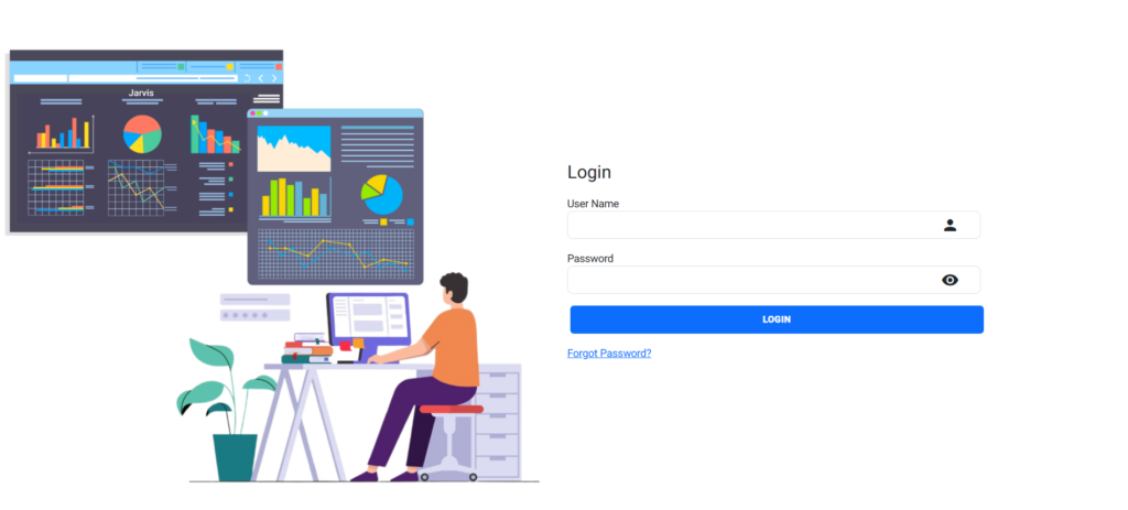
2.1. Login:
Enter your username and password to login the application and click on the login button The login button triggers the authentication process and allows users to log into their accounts.
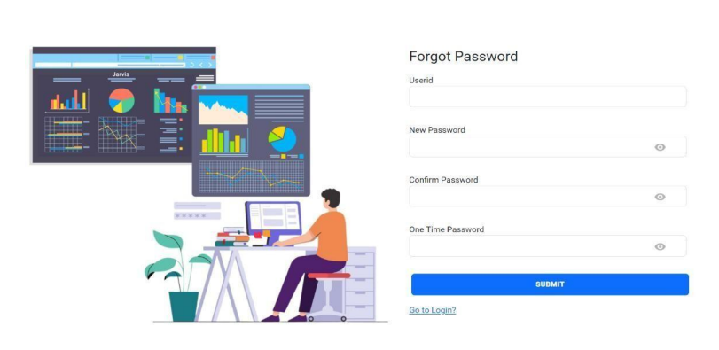
2.2. Forgot Password:
The “Forgot Password” feature provides users with a way to recover or reset their password if they have forgotten it. Click a link “Forgot Password” that redirects users to the password recovery page or process.
Enter your userId, which corresponds to your userName. Based on the provided username, we will send the one-time password (OTP) to the email associated with the user account.
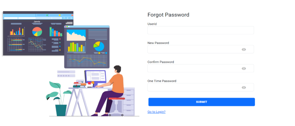
• Enter username in the userId field.
• Enter new password
• Next confirm the password you entered.
• You get a mail with an OTP enter that OTP and submit.
After submission, initiate the authentication process and access your account. If the entered username or password is incorrect, the pop-up message will display, and it indicates that an Error Password Invalid has occurred. If the username and password are entered correctly, the login page will redirect you to the main application.
When you login for the first time, you’ll see a blank landing page like the one below.
Go to the environment page create environment with valid prefix (which you have provide in config.ini or config cm) now you can access landing page belongs to that environment.
3. Environment Creation:
When you click on “Environment Creation,” you will find options to both “Create Environment” and “Manage Environment.”
3.1 Create Environment:
In the “Create Environment” section, the fields for Environment, “Environment Name “Index Prefix” are mandatory and must be filled out.
Note: The environment Name field will not allow any special characters
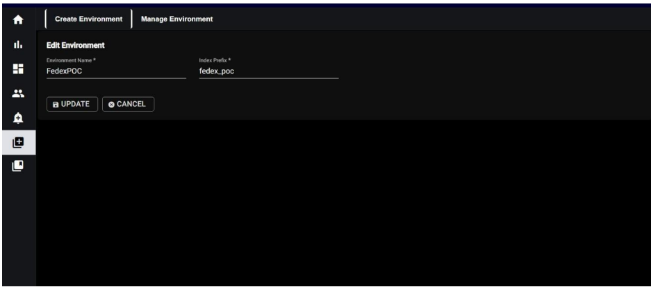
3.2 Manage Environment:
In the “Manage Environment” section, you will see a list of environments with fields “Name,” “Prefix,” and “Action.” Within the “Action” column, you can perform actions such as editing or deleting the environments as needed.
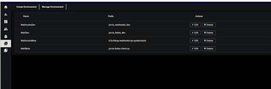
Now you can switch the environment as shown below.
4. Environment Switch:
When you click on “Environment Switch,” you will see option as environment name which is created by you along with a pop-up window where you can select the desired environment for your current task.
⦁ In the selected environment
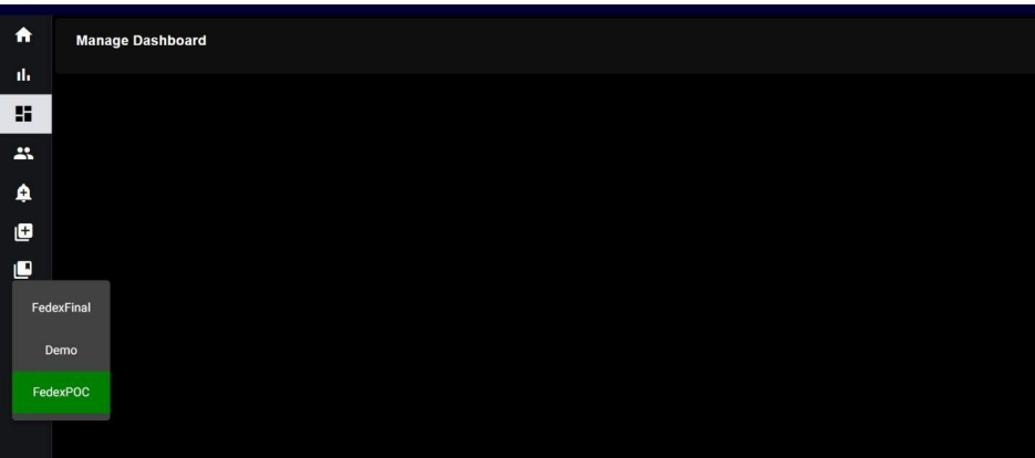
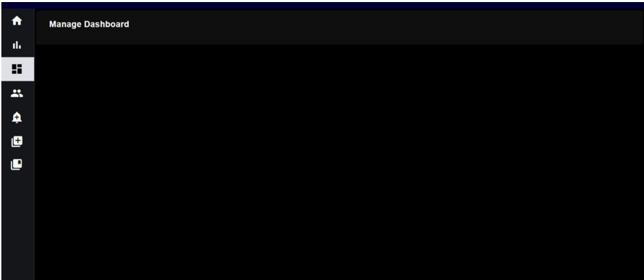
You can access dashboards. Here we get empty manage dashboard because we have not created any dashboards.
5. Dashboard:
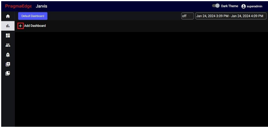
If you want to create a new dashboard, click on the Add Dashboard icon mentioned in the screenshot.
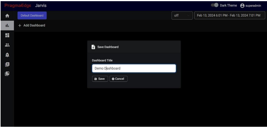
Need to provide the title of the dashboard and select save to complete the creation
If you are in Create dashboard and if you want to create a new dashboard again, you must go to manage dashboard and then click on Create dashboard. If you click on Create dashboard again, the current dashboard won’t get cleared.
5.1. Panels:
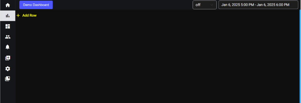
If you want to create a new panel, click on the Icon mentioned in the screenshot. After that row was added successfully.
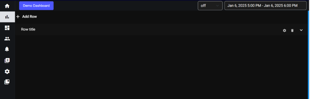
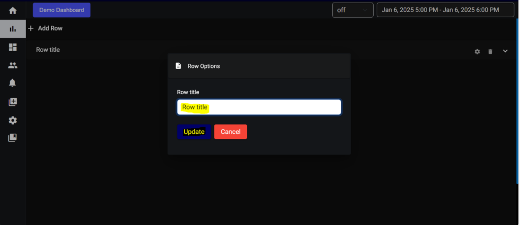
If You want to change the row title, click on settings symbol provided on right side of the row.
The configuration of the panel is set to the right end of the panel title, these configurations contain.
- Delete the panel.
- Add Graph.
- Expand or minimize panel.
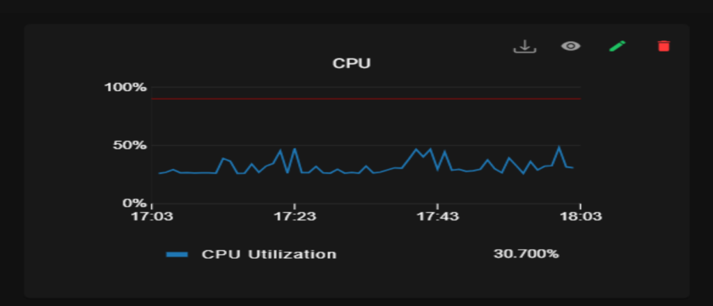
Each panel contains visual representations of data. For graph you have three options:
View the Complete Graph: This option allows you to see the full, unaltered graph with all its data and settings. It’s useful for simply viewing the graph as it is.
Edit: Clicking on “Edit” allows you to modify the graph.
You can work with multiple queries, allowing you to customize the data displayed in that graph. After clicking on the alert tab, you can set up multiple alerts to monitor specific conditions within your data.
For query and alerts you have Preview and Update Graph option:
Preview is for checking the applied changes in graph without saving it.
Update Graph is for updating the changes in the database and to save the changes made.
After clicking update graph you will get a pop-up message of “graph updated Successfully”.
Delete: Selecting “Delete” will remove the graph entirely from the dashboard or visualization, permanently eliminating it.
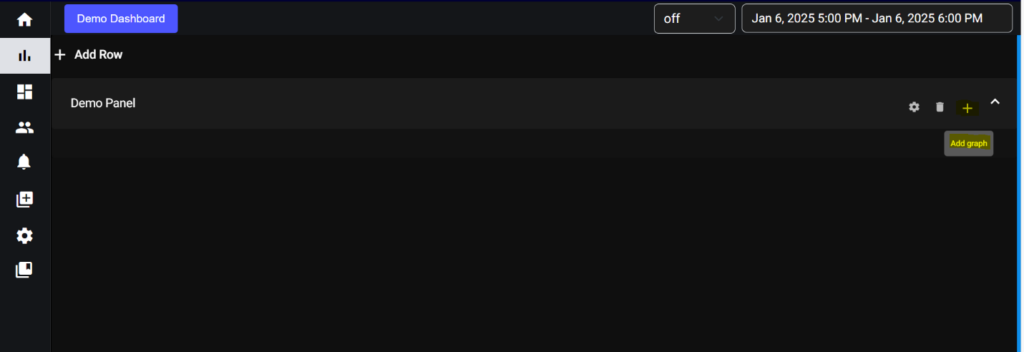
Provided the title of the panel and update. Then expand the row you will get the add graph symbol (+) like shown in below screenshot.
5.2. Graphs:
Application contains four types of graphs:
- Line graph
- Gauge graph
- Table graph
- Text graph
- Bar graph
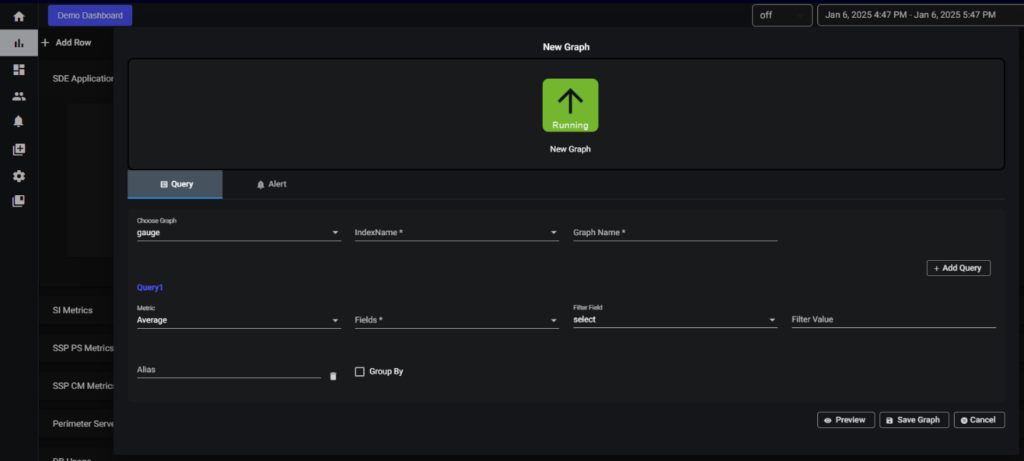
For add graph you will get the create graph page like shown below
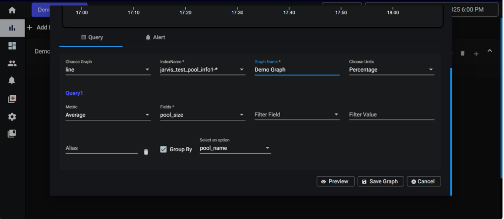
5.2.1. Line graph:
In choose Graph select the type of graph you want. Provide an index name and give the graph a name. After that select the units in which type you want to show your data (Numeric, Percentage and Bytes) and select the metrics for in which metrics you want to show your data (Average, Sum, Count) after that select a filed. If you wish to filter data based on a field, provide the filter field and filter value. Alias name can be used to name your query. Finally click on the save graph button your graph is created.
Note: GroupBy will working only for single query it won’t work for multiple queries.
This group by function filters data based on specified fields and then groups the filtered data, accordingly, providing it in an organized manner.
Single Query Graph:
Multiple Queries Graphs:
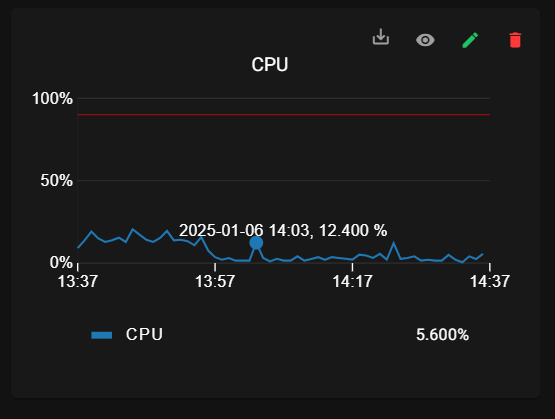
For line graph we have tooltip feature:
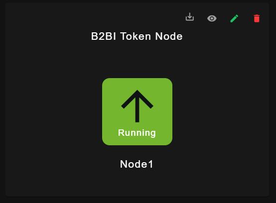
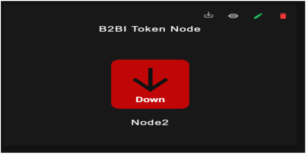
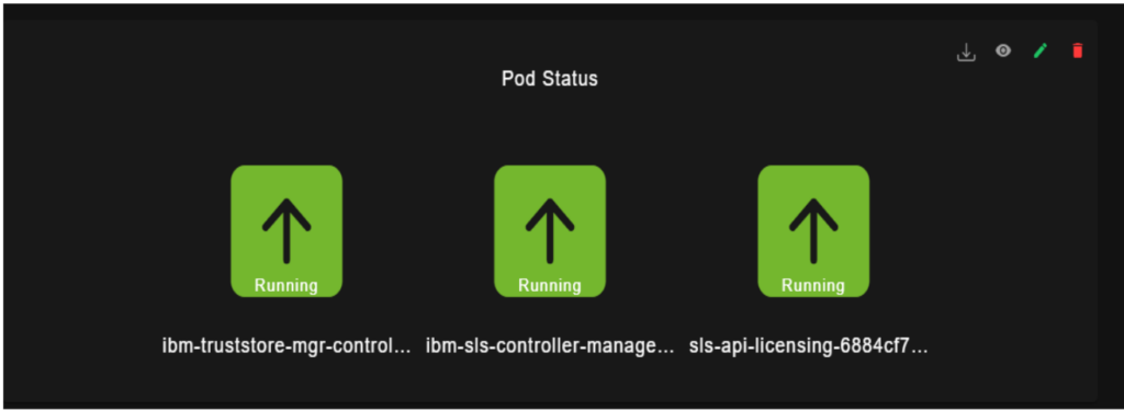
5.2.2. Gauge graph:
If the graph is configured as Gauge graph it will display the status of the specified application (Up (or) Down). Gauges have view, edit and delete options.
Application up:
Application down:
Group By Gauge:
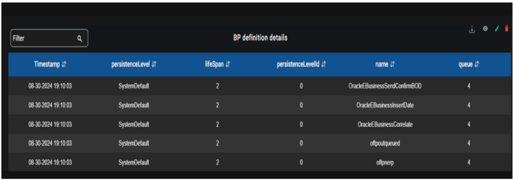
5.2.3. Table graph:
If the graph is configured to a table, the data is represented in tabular format, table has View and delete options. The table graph will show only 25 lines on the main dashboard.
The table features have both filtering and sorting functionalities. Additionally, there is a filter box enabling users to search for specific data. Each field within the table is accompanied by arrow icons allowing users to sort the data in ascending or descending order upon clicking them.
For editing we have pagination and sorting:
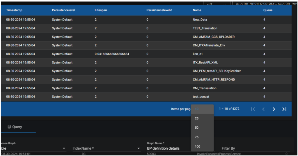
5.2.3.1 Table search:
Filter By in Query:
- Search Using Column Name: To filter the data in table for a particular column use column Name: keyword to search in Filter By field in query and update the graph.
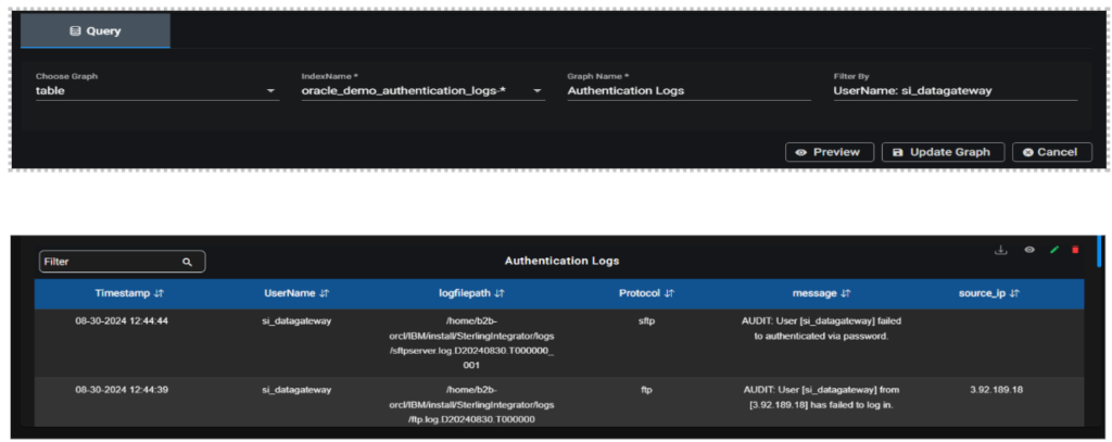
- Search Using keyword: Directly enter the keyword you want to search for in the “Filter By ” field. It is useful to search all the column values in the table.
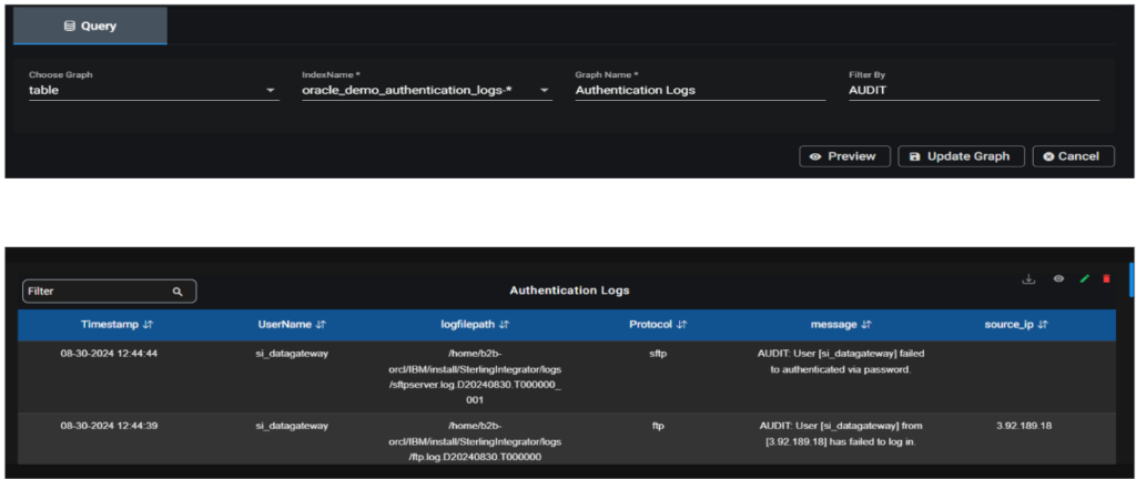
Note: Search with special characters other than underscore won’t be possible.
Filter on top left of Table Graph:
It works the same way as filter by, but it only searches for values in the latest 25 records.
5.2.4. Bar graph:
If the graph is configured to bar, the data is represented in bar plots, bar graph has View, edit and delete options.
Bar Graph for single query:
Group By for Bar graph:
5.2.4. Text graph:
If the graph is configured to text, the data is represented in text format, text graph have View, edit and delete options.
Text Graph for single query:
Text Graph for Group by:
6.Manage Dashboard:
Manage dashboard is used to view the created dashboards and its graphs.
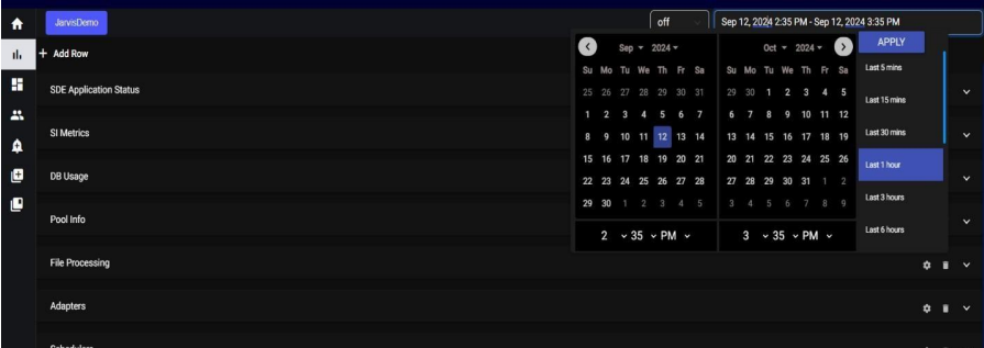
6.1. Calendar Date Selection:
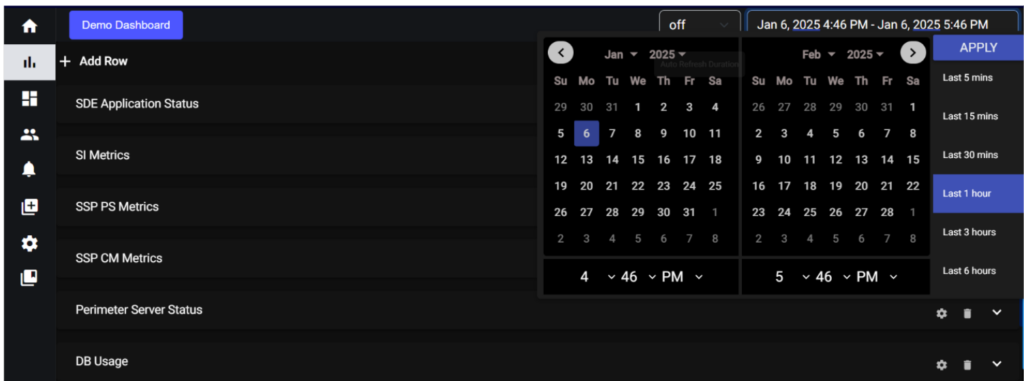
Located at the upper right side of the interface, the calendar feature allows users to retrieve specific data by selecting a date. This is particularly useful for accessing historical data that occurred on a specific day. Users can click on a date within the calendar to choose their desired date, and the system will retrieve data related to that selected date.
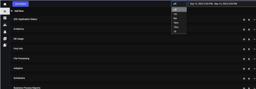
6.2. Auto Refresh:
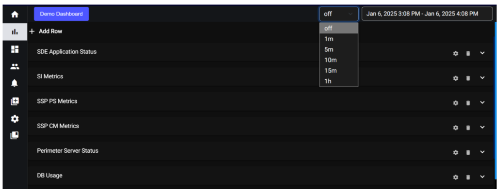
The auto-refresh functionality is a convenient feature that automatically updates or refreshes the displayed data at regular intervals. Users have the option to turn this feature on or off based on their preferences.
Auto Refresh Off:
Users can disable auto-refresh if they prefer to manually refresh the data or if they want to freeze the data at a specific point for analysis.
Theme Options: We provide both dark and light themes for your interface, with the default theme set to dark. This means that when you initially access the application, it will be in dark mode by default. However, you have the flexibility to switch to the light theme if you prefer a different visual style.
5.2 Inside the Dashboard, the “+” icon indicates adding a new dash
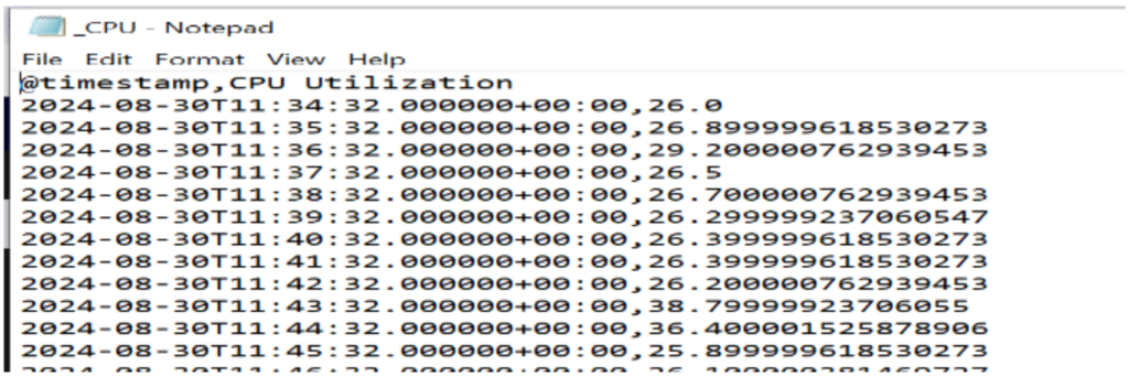
6.3. Download CSV:
The IANN Monitor application includes a CSV download feature that allows users to export data displayed in graphs for a specified time interval selected in the calendar.
Check out the information below on downloading CSV files:
- Select the graph from which you want to download the CSV data, then click the download button located at the top of the graph.
- Check your Downloads folder for the file, then open it to view the data.
7. Alerts Data:
In this, we have two features as shown below.
• Alerts
• Notification Channel
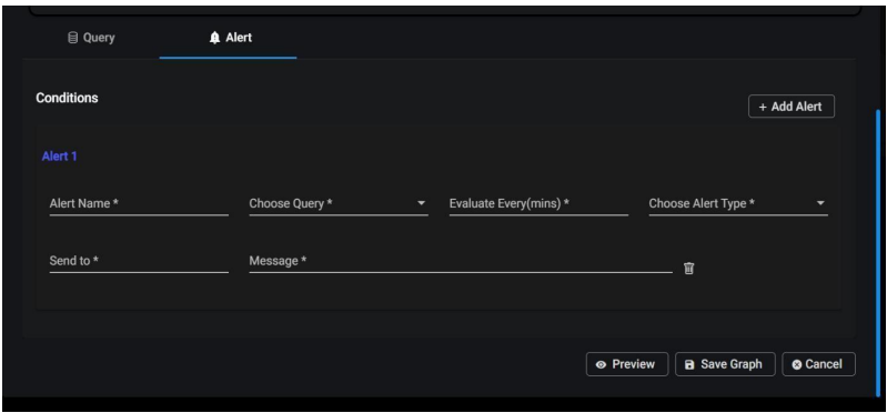
7.1. Alerts:
To create or change the alerts on the graph page, select the Alerts tab, Enter all the necessary information, including the alert name, the query for which you want to generate an alert, the evaluation frequency (how many minutes to evaluate), the alert category (critical or warning), and the email address to which you want to send the alerts and message.
Here you can create many alerts, but the graph will only show the top three alerts. When you click on the edit option to view all the configured alerts on the graph. If you try to configure an alert using a decimal number, it will be considered as a whole number.
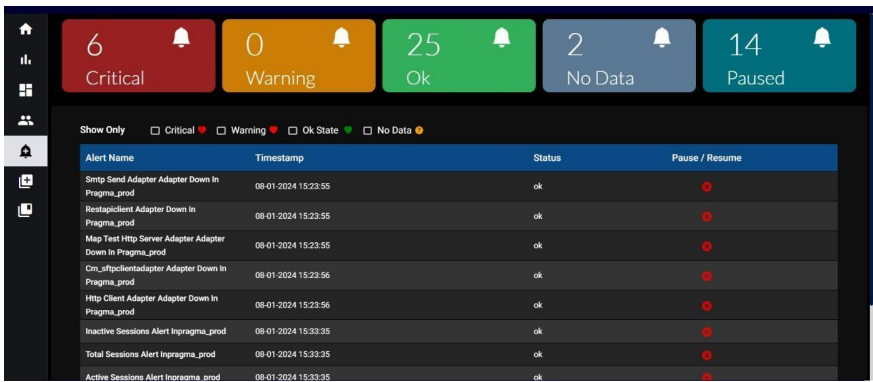
• There are five types of alerts that are displayed when we navigate to the “Alerts Data” section:
o Critical
Alerts o
Warning
Alerts o Ok State Alerts o No Data
Alerts o
Paused
Alerts
For every alert, you will see the following fields inside each of these categories:
Alert Name: The name or title of the specific alert.
Timestamp: The date and time when alerts are triggered or last updated.
Status: The status of the alert (e.g., Critical, Warning, Ok, No Data).
Play / Pause: A control option to enable or disable the alert notifications.
A filter option for various alert types is available on this page. To customize the alerts, check the boxes next to the different alert types. While configuring warning alerts, the range value is exclusive. For example, if we configure alert for warning value 2 to 5, Only when the value is 3,4 i,e., in between 2 to 5 alert state will be changed.
7.1.1 Alerts for Group By:
Alert rises for group by in the following scenarios:
• When the state of the alert gets updated.
• Whenever a normal alert converts to a group by alert.
• if there are any new key fields in the current values of the raised alert compared to the previously raised alert.
Ex: Alert rises when previously node 1 is down and now node2 also down. Only one alert is raised when only node 1 is down, no multiple alerts are generated. • No resolved mail is sent.
Ex: if node1, node2 are down alert notification is sent. Then, node2 becomes active
and no resolved alert notification is sent.
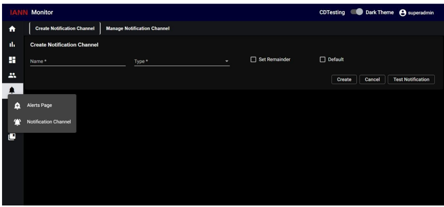
7.2. Notification Channel:
When you click on the Notification Channel, the following page will appear. On this page, you will find two sections: Create Notification Channel and Manage Notification Channel.
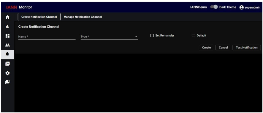
To create a new channel:
Click on create notification channel, Provide the necessary details, such as
• Channel Name
• Channel Type
• Set Reminder
• Default
Channel Name: Provide the name of the channel which you want to configure.
Channel Type: When you click on channel type you are getting types as a dropdown which are
• Email
• Snow
• XMatters • PagerDuty
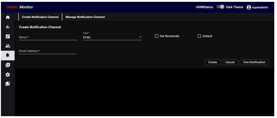
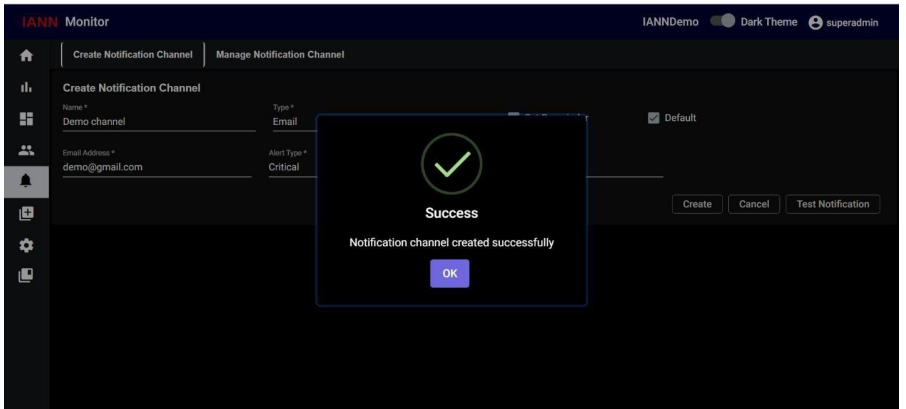
7.2.1. Email:
When you select Type as Email, an additional field, Email Address, will appear. Enter the email address you want to configure for this channel in this field.
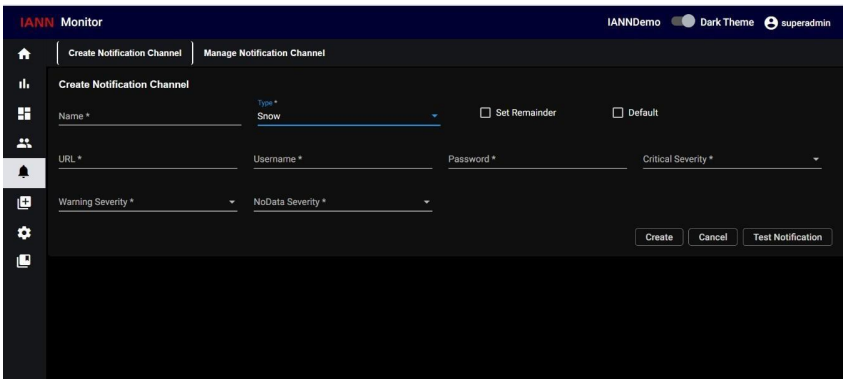
7.2.2. Snow:
When you select Type as Snow, an additional field added which are, URL, Username, password, Critical severity, warning severity and no data severity will appear. Add all those details and select the severity levels (Critical, Warning, and No Data Alerts) that need to be reported to Service Now.
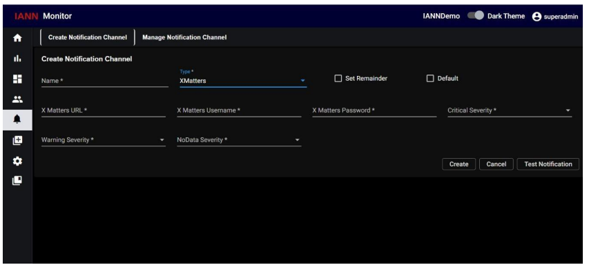
7.2.3. XMatters:
When you select Type as XMatters, an additional field added which are, XMatters URL, XMatters
username, XMatters password, Critical severity, warning severity and no data severity will appear.
Enter the XMatters URL, UserName, Password for the XMatters channel and select the severity
levels (Critical, Warning, and No Data Alerts) that need to be reported to XMatters.
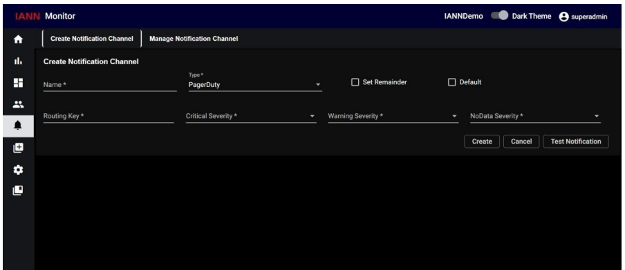
7.2.4. PagerDuty:
When you select Type as PagerDuty, additional fields are added which are, Routing key, Critical severity, warning severity and no data severity will appear. Enter the Routing Key for the PagerDuty channel and select the severity levels (Critical, Warning, and No Data Alerts) that need to be reported to PagerDuty.
Set Reminder: Set the Time Interval for the channel (this needs to be configured if Set Remainder is turned on).
Default: Set the Alert Type for which this channel configuration will be applied by default, if Default is turned on. Once all the required information is filled in, click the Create button located at the bottom-left corner of the screen.
Manage Notification Channel:
When you click on the Manage Notification Channel will get the list of notification channels like below
8.Landing Page:
In the landing page, we provide an overview of various key components and aspects of our system. These elements include:
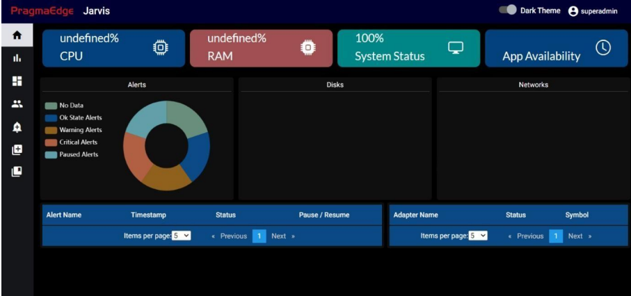
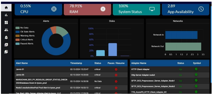
8.1. System Status:
Provides an overall health indicator or status of the system, indicating whether it is running smoothly or if there are issues.
• System Status: Displays the current System status as a percentage.
• RAM: Displays the current RAM (memory) usage as a percentage.
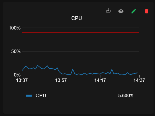
• CPU: Displays the current CPU (processor) usage as a percentage.
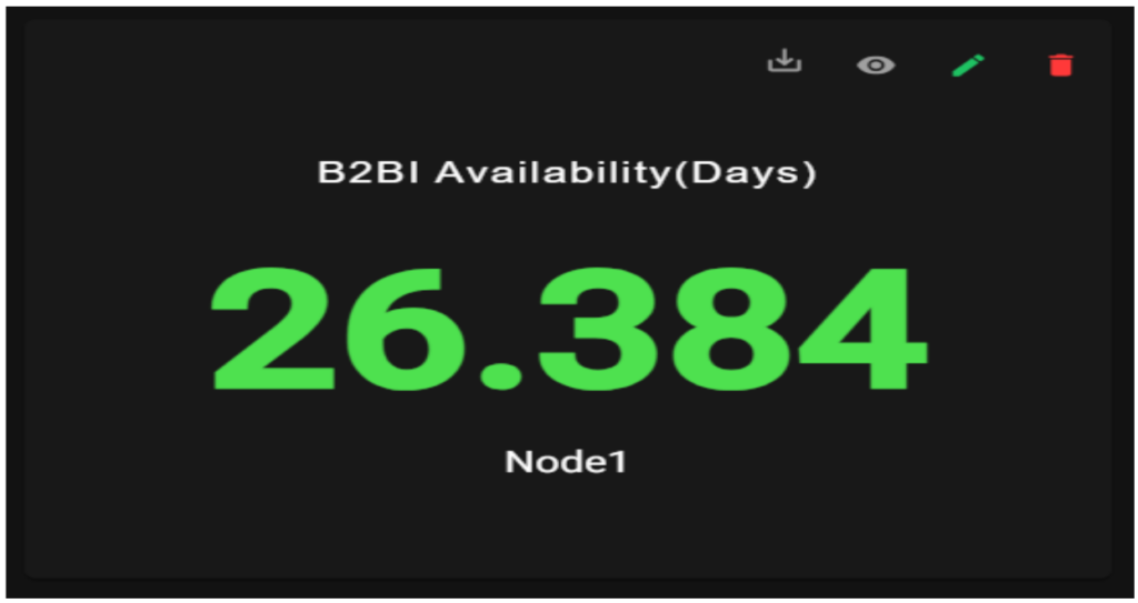
• App Availability: It represents the Number of days from when the SI application is up and running.
8.2. Alerts:
Here we will be showing all alerts in pie chat. Each colour contains an alert type. If you hover the pie chat it will show those alert count.
8.3. Disk Status:
• Disks: These bar graphs represent the used storage space or capacity of the disks
8.4. Network Status:
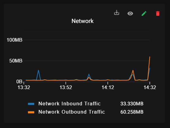
• Network Inbound Traffic: It Shows the amount of incoming network traffic, often measured in data units like bytes/Sec
• Network Outbound Traffic: Shows the amount of outgoing network traffic, often measured in data units like bytes/Sec
8.5. Alerts:
• Alert Name: Lists the name or description of the specific alert or issue.
• Timestamp: Shows the time and date when the alert was triggered.
• Status: Indicates the status of the alert (e.g. critical, No-Data).
• Resume/Pause: Provides options to resume or pause alerts, allowing administrators to act on specific alerts
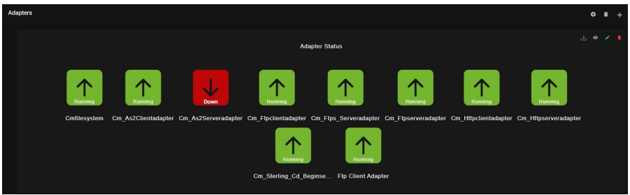
8.6. Adapter Status:
• Adapter Name: Displays the name or identifier of the adapter.
• Status: Shows the status of the adapter (e.g., connected, disconnected).
8.7 Landing Page for OpenShift:
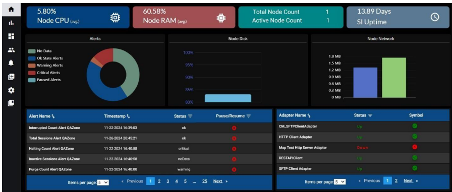
On the landing page, we provide an overview of various key components and aspects of our system. These elements include:
8.7.1 System Status:
Provides an overall health indicator or status of the system, indicating whether it is running smoothly or if there are issues.
• Node Health: Displays the current System status as a percentage.
• RAM: Displays the current RAM (memory) usage as a percentage.
• CPU: Displays the current CPU (processor) usage as a percentage.
• App Availability: It represents the number of days from when the SI application is up and running.
8.7.2. Alerts:
Here we will show all alerts in pie chat. Each colour contains each alert data. If you hover the pie chat it will show each alert count.
8.7.3. Disk Status:
• Disks: These could be bar graphs showing the usage or capacity of the specific disks (e.g., hard drives or SSDs). The bars indicate how much storage space is used compared to the total capacity of each disk.
8.7.4. Network Status:
• Network Inbound Traffic: This shows the amount of incoming network traffic, often measured in data units like bytes or bits per second.
• Network Outbound Traffic: This shows the amount of outgoing network traffic, often measured in data units like bytes or bits per second
8.7.5. Alerts:
• Alert Name: Lists the name or description of the specific alert or issue.
• Timestamp: Shows the time and date when the alert was triggered.
• Status: Indicates the status of the alert (e.g. critical, No-Data).
• Resume/Pause: Provides options to resume or pause alerts, allowing administrators to act on specific alerts.
8.7.6. Adapter Status:
• Adapter Name: Displays the name or identifier of the adapter.
• Status: Shows the status of the adapter (e.g., connected, disconnected).
9. Default dashboard:
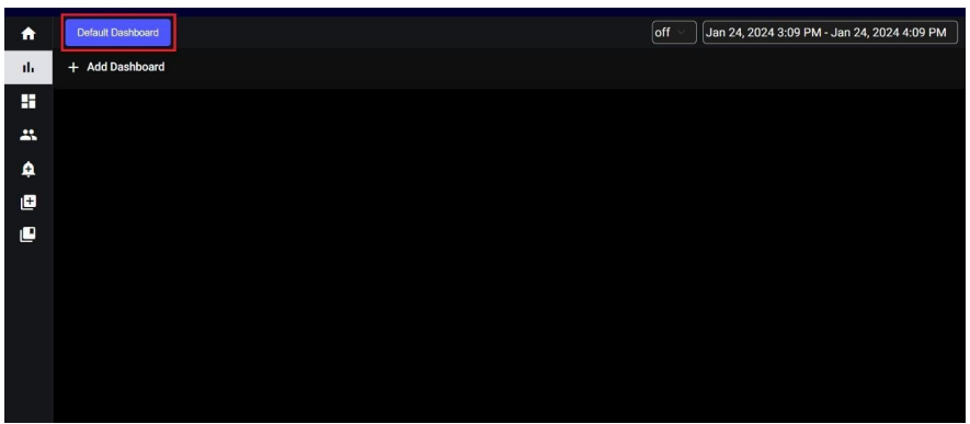
When you click on default dashboard you will get a popup as displayed below.
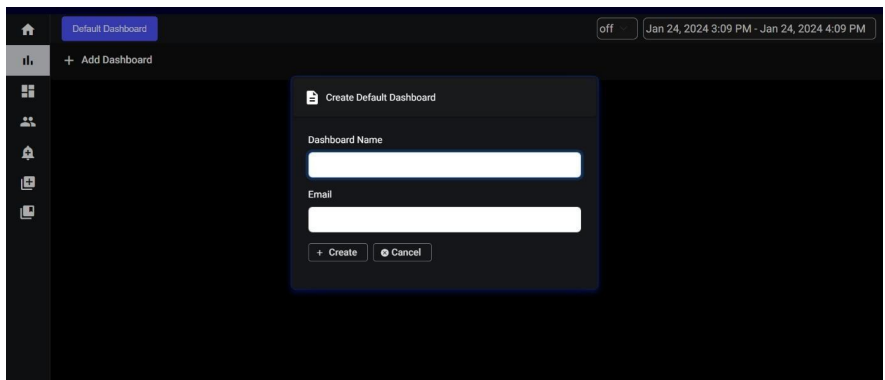
Need to provide the Dashboard name and specify the email to which the graphs are to be configured after clicking ‘create’ the default dashboard is created (takes at least 1min to create) and after creating if you navigate into the default dashboard you will be displayed with the below panels (comes with the default dashboard).
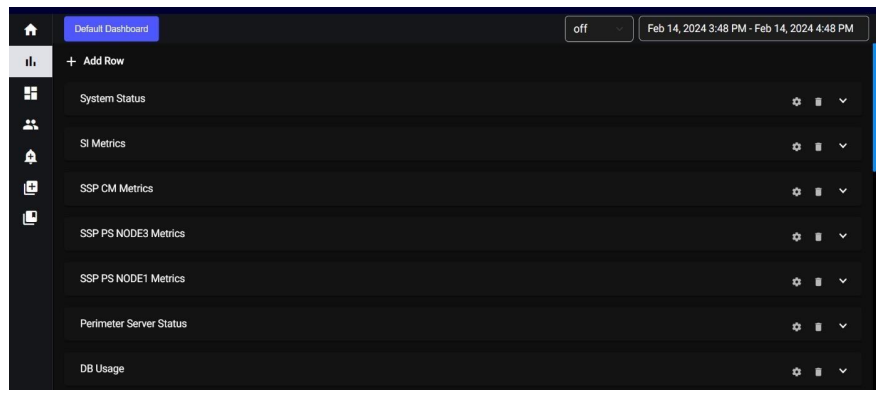
9.1. System Status:
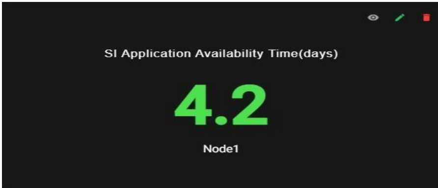
System status contains the App Availability graph
App Availability: It represents the number of days from when the SI application is up and running.
9.2. Metrics:
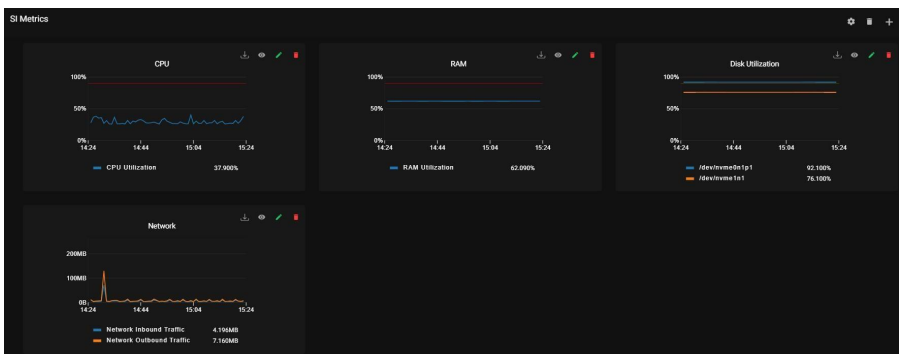
Metrics consist of SI Metrics, SSP CM Metrics, SSP PS NODE3 Metrics, and SSP PS NODE1 Metrics. This panel contains CPU, RAM, NETWORK, and DISK UTILIZATION data in the form of graphs.
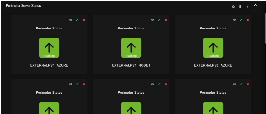
9.3. Perimeter Server Status:
It will show the perimeter server status in gauge graphs
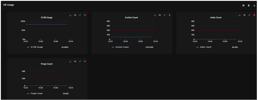
9.4. DB Usage:
This report group has the following data points
Purge Count: Purge cleans up the business process data once it completes its life span.
Archive Count: Purge cleanup of the business process data once it completes its life span.
Index Count: It represents the count of the index which sets all completed or terminated business process data to be ready for archiving or purging.
DB Usage: It represents the overall database size utilized by the SI table space.
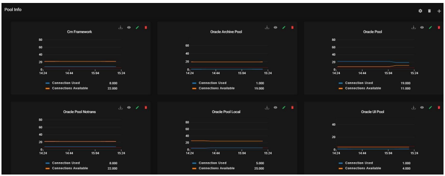
9.5. Pool Info:
It represents a collection of open connections with the database in the SI.
9.6. File Processing:
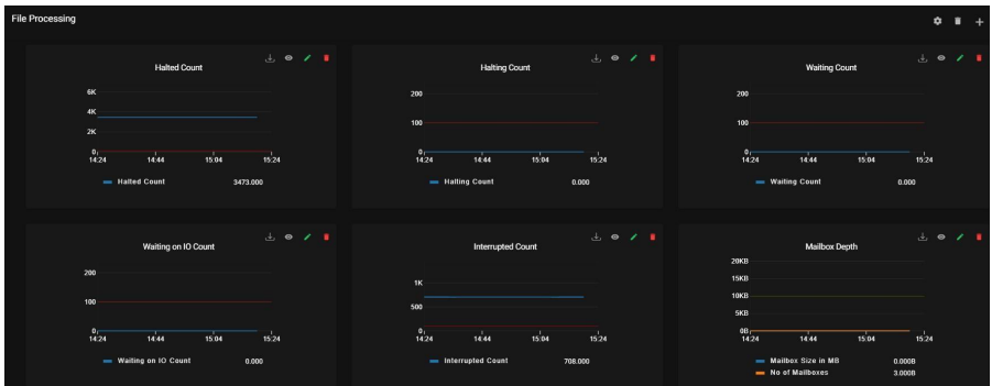
This report group has the following data points
Halted Count: It shows the number of Business processes that are halted.
Halting Count: It shows the count of the business process state between active and halted state.
Waiting Count: It shows the number of Business processes waiting for actions to be completed before continuing to run.
Waiting on IO Count: It shows the number of Business processes waiting for required input
or output and will resume after receiving input or sending output.
Interrupted Count: It shows the count of Business processes which are interrupted by manual or automatic action.
9.7. Adapters:
Adapters are services that connect the Business Process Engine and other system components to dissimilar systems and applications outside of the Sterling B2B Integrator environment. Adapters are reusable—you can include them in multiple business process models.
– Client adapters can connect to both internal and external systems and exchange data
–Server adapters can receive connections and kick off business processes Here is the status of all adapters that are active and inactive for all the different protocols of Sterling Integrator.
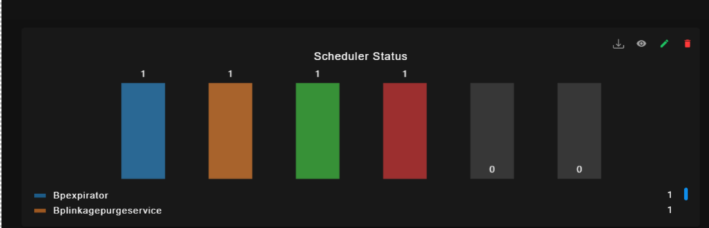
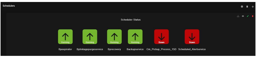
9.8. Schedulers:
This reports the Schedulers status.
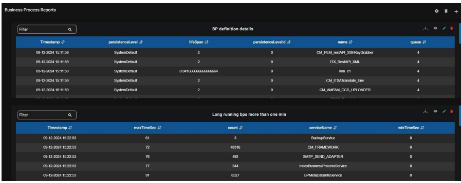
9.9. Business Process Reports:
It shows the details of the Business Process.
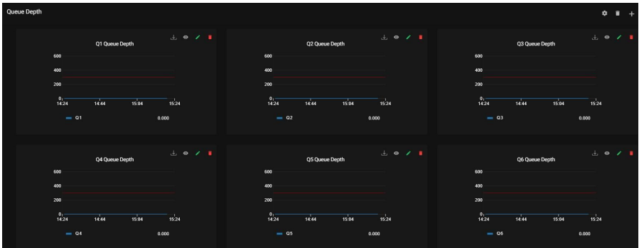
9.10. Queue Depth:
It shows the count of Maximum number of business processes that can be in a queue at a given time.
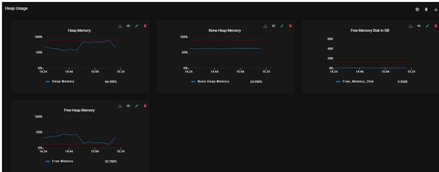
9.11. Heap Usage:
It shows the size of Heap in the SI.
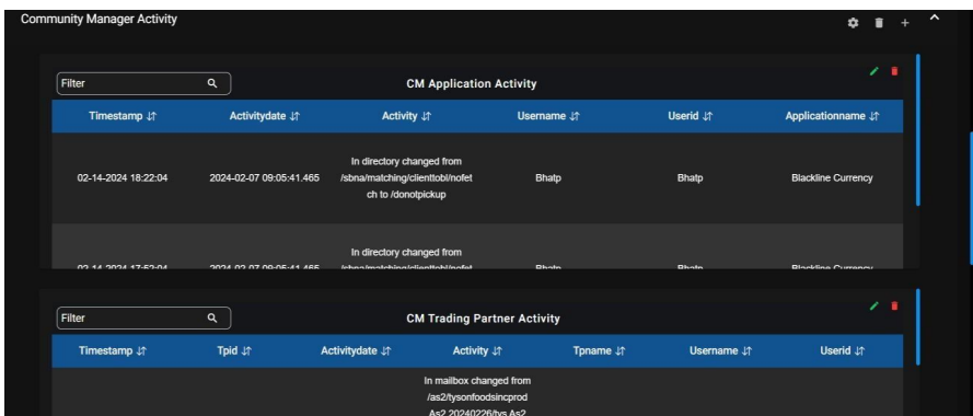
9.12. Community Manager Activity:
Here are the following Activities.
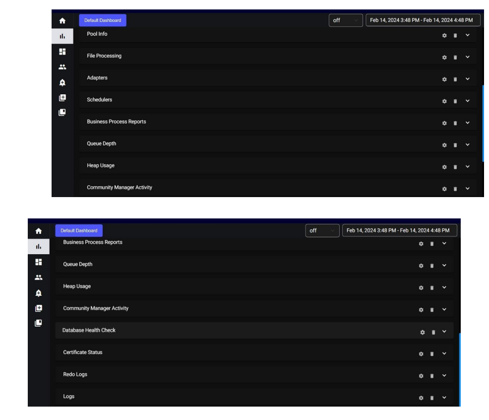
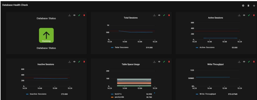
9.13. Database Health Check:
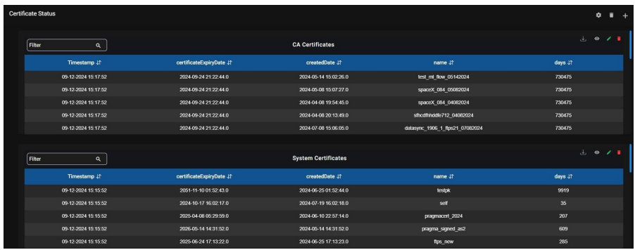
9.14. Certificate Status:
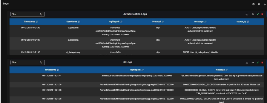
9.15. Logs:
Logs are generated by Sterling B2B Integrator based on monitoring activity. Here we track each component’s activities using the logs provided by Sterling integrator.
10. Access Management:
When you access the “Access Management” section, you will find three main options:
⦁ Create User
⦁ Manage User
⦁ Notification Channel
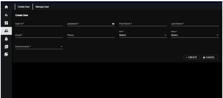
10.1. Access Management - User Creation:
When you click on “Create User” the system will prompt you to provide the following mandatory details to create a new user:
User ID: Unique identifier for the user.
Password: Secure password for the user account.
First Name: User’s first name.
Last Name: User’s last name.
Email: Valid email address for communication and account-related notifications.
Phone: Contact number for the user.
Role: Choose a role for the user from the available options.
Status: Select the status of the user (e.g., Active, Inactive).
Environments: Select an environment from the options below.
10.2 Access Management - User Management:
When you click on “Manage User,” In the “Manage User” section, you have the capability to search for and handle existing
users based on various criteria:
User ID: Search for users using their unique user ID.
First Name: Search for users by their first name.
Last Name: Search for users by their last name.
Email: Search for users by their email address.
Role: Filter users based on their assigned roles from the available options (e.g., SUPER_ADMIN, ADMIN, BUSINESS_ADMIN, BUSINESS_USER).
Status: Filter users based on their status (e.g., Active, Inactive).
For both role and status, you will be presented with a list of options to choose from, allowing you to select the most appropriate role and status for the user you are managing.
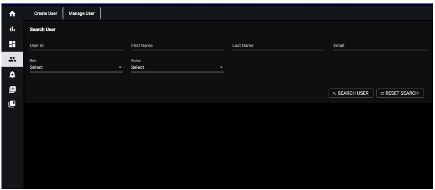
If you don’t enter any specific information in these search fields and click on “Search User,” the system will display all users by default. Below the list of users, you will find the following options for managing the users:
• Edit: This option allows you to modify the user’s information, such as updating their name, email, role, or other relevant details.
• Delete: You can use this option to remove a user permanently from the system.
• Activate: This option activates an inactive user, allowing them access to their account and associated privileges.
• Deactivate: You can use this option to deactivate an active user, restricting their access and privileges until reactivated their access and privileges until reactivated
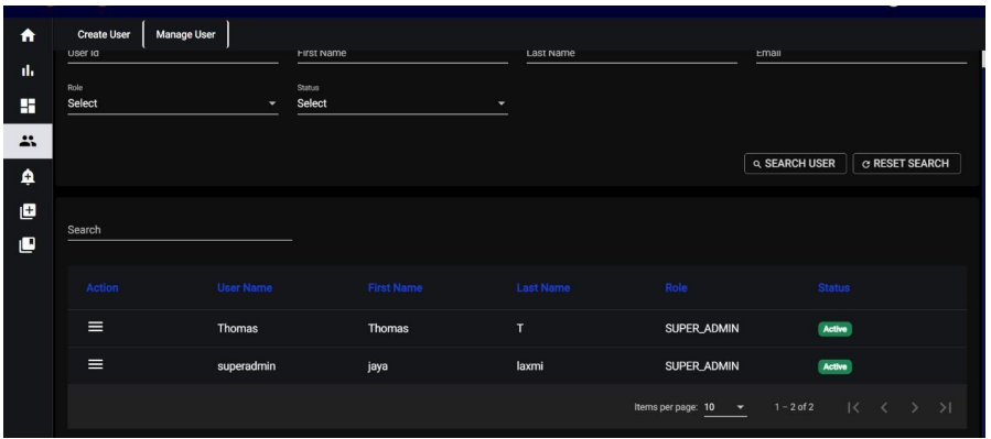
By using these management options, you can efficiently control and maintain the user. By using these management options, you can efficiently control and maintain user accounts based on your specific requirements.
11. Features:
11.1. Calendar Date Selection:
Located at the upper right side of the interface, the calendar feature allows users to retrieve specific data by selecting a date. This is particularly useful for accessing historical data that occurred on a specific day. Users can click on a date within the calendar to choose their desired date, and the system will retrieve data related to that selected date.
11.2. Auto Refresh:
The auto-refresh functionality is a convenient feature that automatically updates or refreshes the displayed data at regular intervals. Users have the option to turn this feature on or off based on their preferences.
Auto Refresh Off:
Users can disable auto-refresh if they prefer to manually refresh the data or if they want to freeze the data at a specific point for analysis. Theme Options: We provide both dark and light themes for your interface, with the default theme set to dark. This means that when you initially access the application, it will be in dark mode by default. However, you have the flexibility to switch to the light theme if you prefer a different visual style. 5.2 Inside the Dashboard, the “+” icon indicates adding a new dashboard. Clicking on the “+” icon will trigger a pop-up message titled “Save Dashboard.”
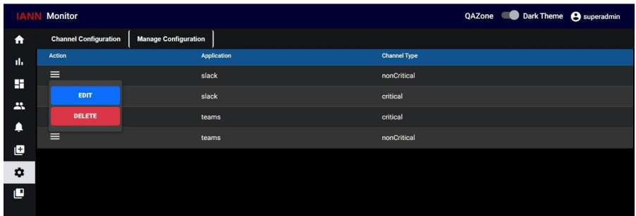
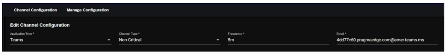
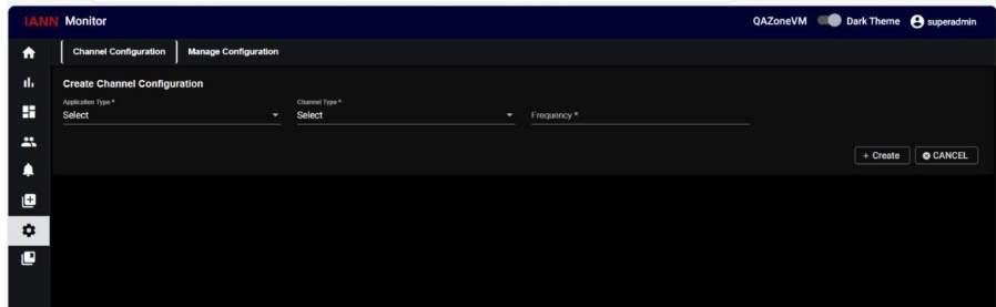
12.Channel Configuration:
IANN Monitor sends the Notification to the channel through channel email ID. The IANN Monitor relays:
• Overall health status of an environment to the “IANN Non-Critical” channel.
• Critical alerts to the “Critical” channel.
Create Channel Configuration:
12.1. Teams:
Navigate to the Channel Configuration Page. Open the channel configuration interface within the IANN Monitor UI
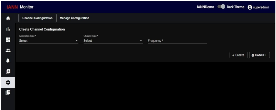
Select Application Type as Teams. Choose the Channel Type based on your requirement.
Critical: Sends critical alerts for the environment.
Non-Critical: Provides overall environmental health status.
Configure the Frequency (interval in minutes or hours for sending notifications), enter the
Channel Email ID and click Create to save the configured channel.
12.2. Slack:
IANN Monitor sends the Notification to the Slack channel through Webhook URL. The IANN Monitor relays:
• Overall health status of an environment to the “IANN Non-Critical” channel.
• Critical alerts to the “Critical” channel.
Navigate to the Channel Configuration Page. Open the channel configuration interface within the IANN Monitor UI.
Select Application Type as Teams. Choose the Channel Type based on your requirement.
Critical: Sends critical alerts for the environment.
Non–Critical: Provides overall environmental health status.
Configure the Frequency (interval in minutes or hours for sending notifications), Enter the webhook URL generated for the channel.

Click Create to save the configured channel
Manage Channel Configuration:
When you click on Manage Channel Configuration you can see a list of channel configurations below
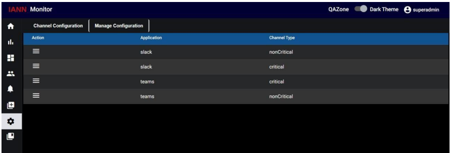
Here in actions column, you can see the edit symbol, here you can perform edit and delete
operations.